CASE STUDY: INFORMATION GRAPHICS/ CREATIVE PACKAGING
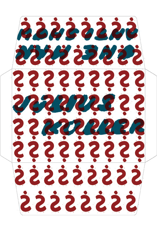
Creative packaging to promote an art exhibition; I chose a retrospective of a Slovak conceptual artist Julius Koller. His work is predominately text based and with my design I wanted to prove that even conceptual art, which is often considered anti-aesthetics, can be richly visual.

I decided to capture Koller’s aesthetic by exaggerating the colour scheme of the materials he often used, like for example postal documents and rubber stamps. The question mark is one of the most significant symbols of Koller’s work, so I used it in combination with
his handwriting, mimicking the rubber stamp texture, to keep every element
of the packaging on brand. I also decided to go for a textured paper for the final printed product to stay in keeping with Koller’s visuals.


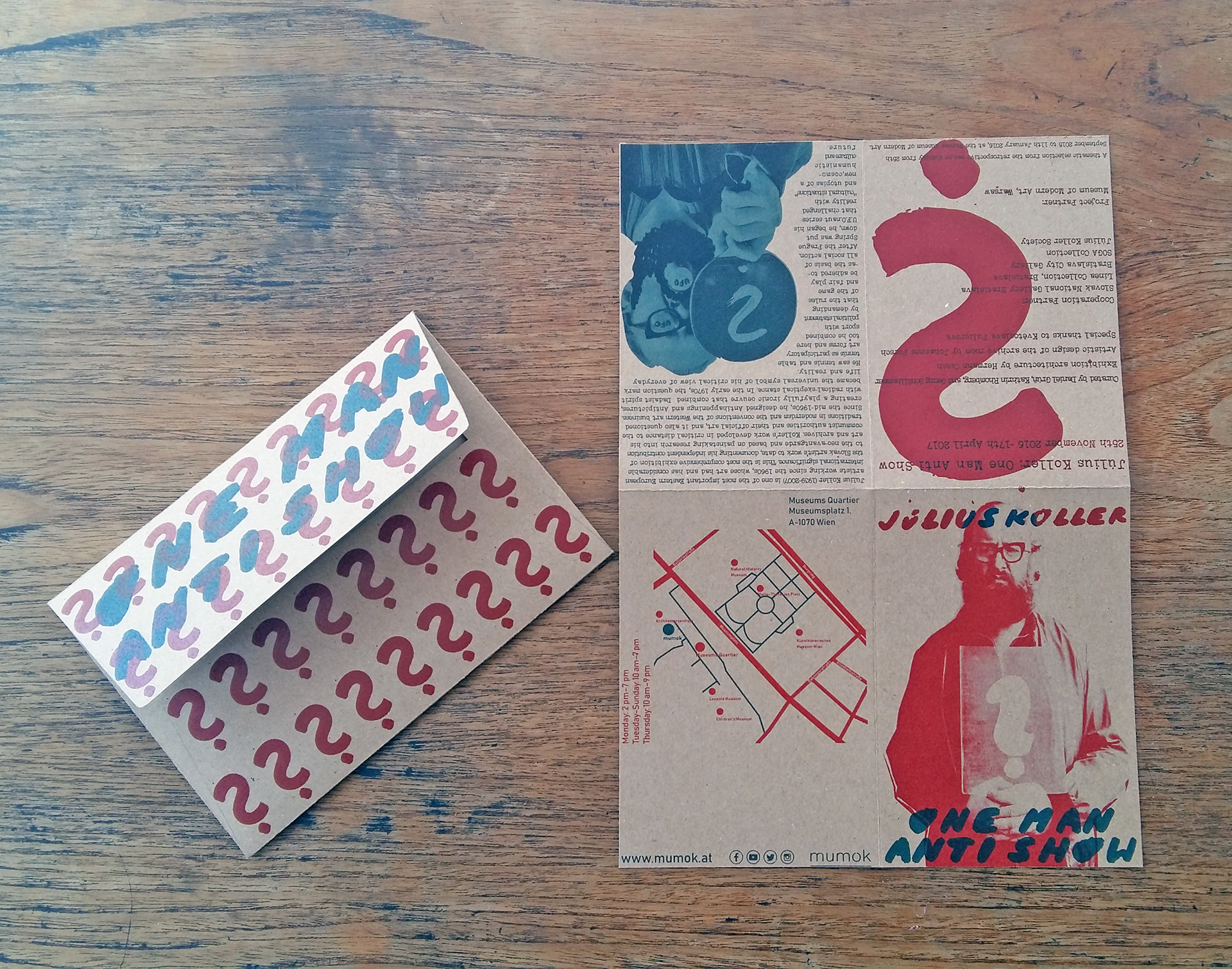

Most of his text-based work used postcards, telegrams and other postal documents, that is why I decided to use the format of the envelope and enclosed brochure to give more information about the artist and the exhibition. I also saw it as a cost-effective
and practical way to promote the exhibition.
The inside brochure folds out to an A4 poster of one of Koler’s photographic works
as an alternative to take-away exhibition postcards. On the other side, there’s information about the artist, the exhibition itself and a simplified map of the gallery’s location.